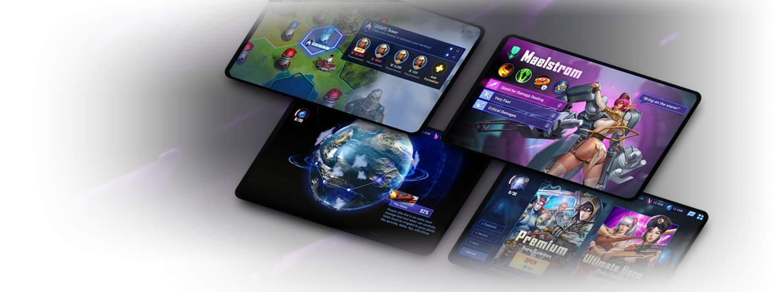
Mobile Game - Character Collector
I helped lead the overall UI vision and player experience in the game. I set up interaction guidelines, UX patterns and UI art style to drive consistency in the game. I also helped hire new team members onto our team and helped ramp them up into the new project.
Features I worked on:
Tutorial - Quests - Campaign - Guild World - HUD - Character Page - Equipment - Skills - Loot Boxes - Store - And many more
Case Study
Quests and Missions
Just like in many games, quests serve as the primary vehicle to engage players with the games content. We wanted to streamline the quest system so that the player seamlessly progressed from quest to quest.
Optimizing the flow
From the beginning it was important that the player didn't have to think or search for the way to start a quest. We made sure that we created linked buttons which started your quest right away, or linked to the menu.
Early concepts:
The quest system was built early on in the game. We decided to try making a standard 3 quest list on the hud and see how it felt. While it ended up being functional, we felt like we could streamline it.
Feedback and Goals:
As we were user testing the feature, it became clear to us that we primarily wanted to use this feature as the funnel for our game.
The initial design had too many choices early game and not enough choices late game. The three list quests list tried to do both, but succeeded at neither in our game.
Priority System
Taking the feedback, we decided to create a "quests on rails system" where we collapsed and streamlined the quests surfaced to the player. The quests became a single line button which linked to the list. This served to both answer the user problem of "what do I do next?" while also introducing the questing system to the player.
Early game, this worked really well by helping the player focus through the main campaign (story quests), and late game, it served us as our daily retention system where it would suggest daily quests first before defaulting back to low priority achievements.
Notification and Attention
"How do you make a red dot stand out in the sea of red dots?"
We wanted to optimize the experience by creating consistent breadcrumbs for the player to follow.
Due to this feature being on the HUD and a part of core gameplay loop, the feature needed to stand out and be appealing to the player.
Taking inspiration from in game companions I thought that adding a tutorial/companion character would be much more engaging than a red dot. Being a character collector we had plenty of story characters to choose from and leaning into our anime inspired art style. I was able to use a chibi style which helped with readability and appeal.
We also opted in to making a highlighted quest in the list that is always auto scrolled in the window and is prominent compared to the other quests.
Doing these changes we saw much better qualitative feedback on how the feature was being perceived and the flow became much more optimized.
Case Study
Campaign Map
At a high level, this was a feature that allowed our players to interact with various instanced content in our game. It is also the primary place the players got introduced to our game world and story.
Goals:
Early Game
Creating context for where the story takes place at.
Anticipating boss fights and progressing through the campaign.
The promise of more content.
Late Game
Replaying the content on different difficulties.
Looking for specific loot to grind for.
Completing all the progression in the campaign
Wireframes
The map required separate branching paths and clear requirements. It also needed to read well from a distance and be easy to use. Creating custom "cartoony" map illustrations fit well with the universe and helped usability. This simplified approach worked well with the horizontal layout by scrolling horizontally.
UI States
Surfacing various rewards and highlighting boss fights helped get players excited early. Showing reward icons on specific nodes helped players find important loot that they are looking for in progression systems.
Traveling in the world
Most of the UI for this feature was fairly straight forward. The main challenge was working with the art team to create a narrative that made sense.
After some brainstorming we landed on the idea of travelling in a battleship and the map becoming a semi holographic display of locations the player can travel to.
Because we didn't end up having much cinematic and in depth story for where the player was, this became a good contextual grounding to the player in this world.


